Day 13: Punctuate to Improve PowerPoint Readability
Improve PowerPoint readability for users of screen readers by adding punctuation to clarify where one thought ends, and another begins. Adding punctuation will also improve the clarity of your ideas and readability of your document when converting it to an accessible PDF.
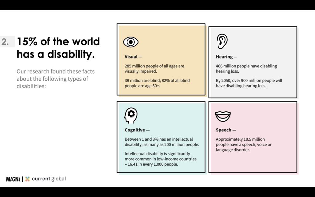
We’ve included an example below of a slide with punctuation done well.

Hint: Read the text on a slide as if it were being read continuously to determine where you should add punctuation to clarify your thoughts.
Let us know what you learned today by posting on social media with #ABD21DayChallenge and #AccessibleByDesign.