Day 11: Use Color Contrast in PowerPoint
Design a short PowerPoint presentation with accessible color contrast to enhance readability for everyone, especially people with color blindness. (About 300 million people globally have color vision deficiency!)
To investigate and improve color ratios, use the Microsoft Color Contrast Analyzer within the Accessibility Checker. Large, bolded text needs a color contrast of at least 3.0 and small text requires a contrast of at least 4.5 to pass the color contrast test.
Check if your content passes this accessibility test by following these steps in PowerPoint:
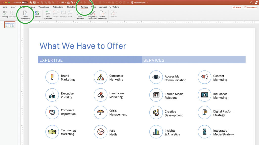
- Navigate to the “Review” tab.
- Select the option to “Check Accessibility.”
- The “Accessibility Pane” will open to the right.
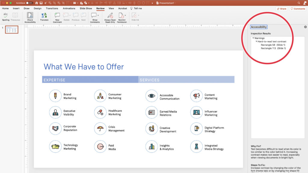
- Within the “Accessibility Pane,” navigate to the list of “Inspection Results.”
- Look for a “Warnings” item in the list of “Inspection Results.”
- If the “Warnings” item is present, click its arrow button to swing out the results.
- Look for “Hard to read text contrast.”
- If present, click the “Hard to read text contrast” arrow button to show a list of slides that need attention, as per the two example slides further down this page.
Note: The color contrast analyzer tests only text objects with a fill color applied to them. Text objects that are placed over separate images or shapes will not be tested. In these scenarios, contrast levels should be tested manually by saving screenshots and using the following hyperlinked online tool: Color Check for ADA Image Compliance.
Most color contrast errors can be solved by simply enlarging the text in question or changing the fill color to be lighter or darker, depending on text color.
To help mitigate color contrast errors, follow these best practices:
- Try to refrain from placing text over images.
- Avoid using color for body copy text.
- Resist applying a fill color on text objects.
Let us know what you learned today by posting on social media with #ABD21DayChallenge and #AccessibleByDesign.